

The essentials · 30-second read
A pricing page is a decision tool: buyers should understand what they pay, what it covers and what happens when they click.
- Match the format to how you sell: public prices for standardized offers, cost drivers and a clear quote process for variable scope.
- Keep the billing unit, commitment, mandatory charges, currency and tax treatment right beside the price.
- Place each piece of proof next to the buyer concern it resolves, and use only approved references.
- Make billing selectors and comparison tables work with a keyboard, without relying on color alone.
- Measure qualified leads and purchases, not button clicks, and change one element at a time.
Summarize this article with AI
A good pricing page tells buyers what they will pay, what that amount covers and what happens when they click. The best business websites put the billing unit, commitment, scope, limits and next step right beside the price, so visitors can judge fit without decoding footnotes or booking a call for basic information.
For founders and marketing leaders, the task is to publish enough commercial detail to qualify demand without oversimplifying what you sell. This guide covers what to show, how to organize it, which public examples are worth studying and how to check whether the page supports useful buying decisions.
Start with the decisions your buyer needs to make
Treat your pricing page as a decision tool, not a display of packages. Before writing copy or designing cards, answer four questions in order:
- Fit: who is this offer for, and which requirements make someone unsuitable?
- Cost: what determines the amount a buyer will actually pay?
- Risk: what commitments, limits or implementation requirements should they understand?
- Action: can they purchase now, or do they need a conversation first?
This sequence gives each element of the page a purpose. A feature belongs on the page when it helps someone select an option or understand a constraint, not simply because the product team wants it mentioned.
It also connects pricing to the wider task of building your website around buyer decisions. Visitors should arrive with enough context to understand the offer rather than meeting an unexplained price list.
Choose a pricing format that matches how you sell
The best business websites do not all publish fixed prices. They make the commercial model understandable, whether the final amount is public or requires a quote. Choose the format according to how reliably you can define the scope before speaking with a buyer.
| Offer type | What to publish | Appropriate next step |
|---|---|---|
| Standardized subscription | Price, billing unit, payment cadence, limits and additional charges | Select a plan or start an account |
| Defined service package | Fixed price or starting price, included scope, exclusions and payment schedule | Purchase or confirm eligibility |
| Variable-scope project | Budget guidance where feasible, cost drivers, qualification criteria and quote process | Request a scoped proposal |
If you cannot publish a responsible estimate, explain why. Name the inputs that change the price, such as number of locations, integrations or delivery requirements. "Contact sales" becomes far more useful when visitors know what the conversation will establish and what they should prepare.
What the best business websites show beside the price
A headline amount is only useful when buyers can interpret it. Keep the information needed to understand that amount close to the price itself, not in a separate FAQ or a legal page.
| Element | What to state | Example of a clear wording |
|---|---|---|
| Billing unit | Per user, per workspace, per usage measure, per project or per month of service | "Per active user, billed monthly" |
| Commitment | Annual or monthly term, total amount when an annual plan is shown as a monthly equivalent | "Billed annually: total charged up front" |
| Mandatory charges | Setup, onboarding or other unavoidable fees | "One-time onboarding fee applies" |
| Currency and tax | Currency displayed and whether tax is included | "Prices in EUR, excluding VAT" |
| Scope and limits | What is included, what is excluded, which limits trigger an upgrade | "Up to 3 locations; add-ons quoted separately" |
| Next step | What the button starts and whether payment is requested at that stage | "Book a 30-minute scoping call, no payment" |
Define the billing unit and commitment
State exactly what the amount buys and when payment happens. For subscriptions, distinguish between per-user, per-workspace and usage-based pricing. A monthly and annual toggle is a common pattern on SaaS pricing pages (Smashing Magazine reviews several examples), but the toggle should not be the only explanation: if an annual commitment is displayed as a monthly equivalent, show the annual billing condition next to it.
For services, explain whether the amount covers a project, a recurring retainer or a defined deliverable. Visitors should also be able to find renewal, cancellation and minimum-term conditions before committing. Keep essential commercial terms visible, with detailed legal language available separately.
Describe scope through meaningful differences
Package names should help buyers identify fit, not make them guess what "Growth" or "Premium" means. Explain plan differences in terms buyers can evaluate:
- supported workflows or use cases;
- operating limits (users, volume, locations);
- service coverage and support availability;
- implementation needs and required add-ons.
Avoid a long matrix of nearly identical checkmarks. If every option includes a capability, explain it once and keep the comparison area for real differences. Define unfamiliar terms beside the feature, which is the job of good UX writing, rather than sending visitors elsewhere.
For service businesses, clear exclusions are as useful as inclusions. The same principle applies when buyers compare website packages beyond the headline price: scope determines whether two apparently similar offers are actually comparable.
Explain what happens after the click
A button label should describe the action it starts. "Request a quote" and "Book a demo" create different expectations. Tell visitors whether they will open a calendar, submit requirements, create an account or enter checkout, and say so when no payment is required at that stage.
For a sales-assisted offer, explain what information you need and what the buyer receives next. Only publish a response time if your team can reliably meet it. Use one primary action per buying path: a separate enterprise inquiry can serve a different audience, but several competing buttons on the same package make the decision harder.
Place proof beside the concern it resolves
Pricing-page evidence should answer a commercial question, not decorate the page. Match each type of proof to the doubt it removes:
| Buyer concern | Proof that answers it | Where to place it |
|---|---|---|
| "Is this for a company like mine?" | A relevant customer story from a similar organization | Beside the plan that customer uses |
| "How hard is it to get started?" | An implementation example or onboarding outline | Near setup fees or the onboarding mention |
| "What if something goes wrong?" | A clearly defined support process and its scope | In the plan comparison, on the support row |
| "Can I trust this vendor?" | Approved customer references and genuine testimonials | Below the plans, before the FAQ |
Use genuine testimonials and approved references only. Do not turn an isolated result into a general promise, or place a recognizable logo beside an offer the customer never used. Connect this evidence to the wider trust signals a professional business website should include: the pricing page summarizes relevant proof, deeper pages provide context.
Study public examples for their pricing logic
Use other companies' pricing pages to examine decisions, not to copy their visual layout.
Stripe's pricing page is a useful reference for separating published standard pricing from a custom commercial discussion. The transferable principle is to distinguish the offer buyers can assess on their own from requirements that need individual scoping.
Slack's pricing page is a reference for user-based pricing and billing-cadence presentation. When reviewing it, look at which information lets a buyer estimate their own commitment rather than comparing only the headline amounts.
When reviewing any example, record the question each element answers. A card layout suited to a standardized subscription may be inappropriate for a consultancy where research, integrations and delivery scope determine the quote.
Make pricing readable on mobile and accessible
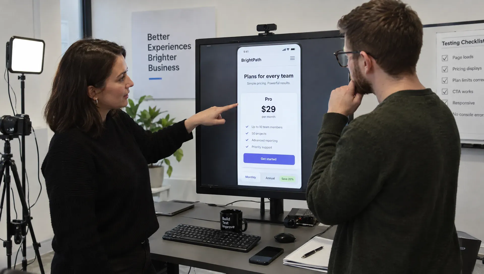
Commercial clarity depends on whether people can actually read and operate the page. On mobile, keep the price, billing condition and action together: do not separate an annual-payment explanation from its monthly-equivalent amount. The WCAG 2.2 guidelines are the reference for contrast, keyboard access and identifiable controls. Four checks matter most on a pricing page:
| Check | How to run it | Reference |
|---|---|---|
| Keyboard | Tab through the billing selector, plan buttons and expandable explanations; each must work without a mouse | WCAG 2.2 criterion 2.1.1, Keyboard |
| Selected state | The selected plan or billing period must be signalled by text or shape, not color alone | WCAG 2.2 criterion 1.4.1, Use of Color |
| Billing selector | A monthly or annual choice where only one option can be active behaves like a radio group | W3C ARIA radio group pattern |
| Comparison table | Use real table markup with header cells so screen readers announce which plan and feature each cell belongs to | W3C tables tutorial |
Horizontal scrolling is acceptable for a real comparison table: the W3C's reflow criterion explicitly excepts data tables from the no-scrolling rule. Keep row labels visible while scrolling, rather than shrinking everything into unreadable text.
Treat these checks as part of the website design work worth paying for, not a cosmetic pass after launch. A pricing selector that works with a mouse but not a keyboard is an implementation problem.
Keep the published offer aligned with sales and billing
An accurate pricing page needs an owner and an update process. Commercial details must stay consistent across pricing cards, forms, proposals and checkout. Assign responsibility for checking those surfaces whenever prices, package names or contractual conditions change, including mobile layouts and alternate billing states.
Whatever the platform, decide which details belong in reusable components or structured CMS content. Avoid maintaining the same commercial facts in several places when the implementation can use a single source. This supports a business website that can scale without becoming difficult to manage.
Before publishing, have sales and the person responsible for billing review the page together. Sales can flag recurring misunderstandings; billing can verify that the displayed offer matches what customers will actually be charged.
Measure qualified progression, not just clicks
A pricing-page change should be judged against the buying process it supports, which is the core of conversion rate optimization. Google Analytics 4 provides recommended events that map to each stage:
| Stage | What to measure | GA4 recommended event |
|---|---|---|
| Request submitted | Completed quote or demo requests from the pricing page | generate_lead |
| Lead qualified | Requests that sales marks as a fit | qualify_lead |
| Self-service start | Visitors who begin checkout from a plan | begin_checkout |
| Purchase | Completed purchases, then cancellations and support questions | purchase |
A button-click increase alone does not establish that the page is doing a better job. Combine analytics with commercial feedback: ask sales which pricing questions persist after prospects read the page. Repeated confusion about billing, scope or eligibility identifies something to explain or test.
Change one meaningful element at a time when traffic allows a useful comparison, for example clarifying annual billing, defining a package limit or describing the next step. Record the change and avoid claiming an improvement from a small or unrepresentative sample.
Avoid mistakes that make the offer harder to evaluate
| Mistake | Why it hurts | Fix |
|---|---|---|
| Unexplained "starting at" price | The figure gives little budgeting value | State the scope the starting amount covers and what moves a buyer beyond it |
| Recommendation without a reason | An unsupported "Most popular" badge says nothing about fit | Use an accurate label such as "Recommended for multi-location teams" |
| Essential terms in footnotes | Footnotes can reverse the apparent meaning of the price | Keep required fees, commitments and material limits beside the offer |
| Form required for basic criteria | Unsuitable buyers only find out after a call | Publish who the offer does not fit, so both sides save time |
Pricing page checklist before publishing
Review the page with someone who did not help create it:
- Can a visitor identify which offer fits their situation without interpreting internal terminology?
- Is the billing unit clear, including user counts, usage measures or project scope?
- Are payment timing, minimum commitments and mandatory charges visible near the price?
- Can buyers identify meaningful limits, exclusions and requirements that affect fit?
- Does each primary button accurately describe what happens next?
- Is supporting proof relevant to the offer and approved for use?
- Can visitors read comparisons on mobile and operate controls with a keyboard?
- Do the pricing page, sales materials and billing process describe the same offer?
Ask the reviewer to explain the expected cost and next step in their own words. If their interpretation differs from the actual offer, revise the content before changing the visual styling.
How BeBranded approaches pricing pages
At BeBranded, a pricing page starts as a consulting question, not a layout. We first work out with you how you sell: which offers are standardized, which need scoping, and which questions sales keeps answering. That becomes the page structure before any design work.
In production, we build on custom Next.js and Payload, or Webflow when it is the right fit, and model offers as structured content so a price, a limit or a condition is edited once and reused across the site. Accessibility checks such as keyboard use and table markup are part of the build, not an afterthought. If your pricing page needs that kind of review, see our consulting service or discuss your pricing-page structure with BeBranded, bringing your current offer, billing terms and recurring sales questions.
Sources
- 1. W3C: Web Content Accessibility Guidelines (WCAG) 2.2 · w3.org/TR/WCAG22/
- 2. W3C: Understanding WCAG 2.2 success criterion 2.1.1, Keyboard · w3.org/WAI/WCAG22/Understanding/keyboard.html
- 3. W3C: Understanding WCAG 2.2 success criterion 1.4.1, Use of Color · w3.org/WAI/WCAG22/Understanding/use-of-color.html
- 4. W3C: Understanding WCAG 2.2 success criterion 1.4.10, Reflow · w3.org/WAI/WCAG22/Understanding/reflow.html
- 5. W3C WAI: Tables tutorial · w3.org/WAI/tutorials/tables/
- 6. W3C ARIA Authoring Practices: Radio group pattern · w3.org/WAI/ARIA/apg/patterns/radio/
- 7. Google Analytics Help: Recommended events · support.google.com/analytics/answer/9267735
- 8. Smashing Magazine: Designing a better pricing page · smashingmagazine.com/2022/07/designing-better-pricing-page/
- 9. Stripe pricing page · stripe.com/pricing
- 10. Slack pricing page · slack.com/pricing