How to build your business website around buyer decisions
Development
•
X min
•
Published on
20.08.2026
•
Updated on
06.09.2026
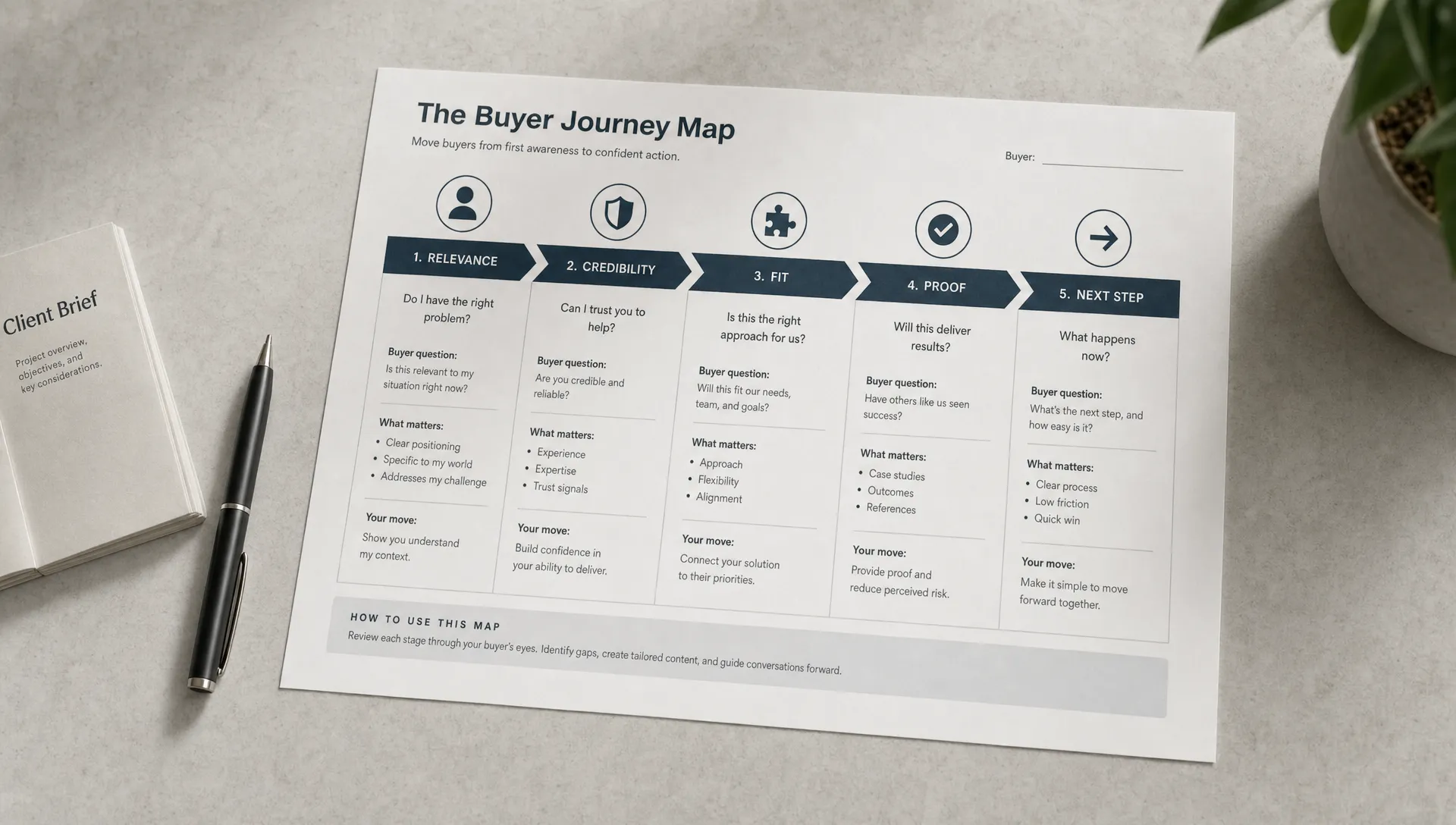
Most business websites are built around internal priorities: services, company history, features, brand language and visual preferences. Buyers do not evaluate websites that way. They move through decisions, and every page either helps them decide or gives them a reason to pause.
To build your business website around buyer decisions, start with the questions your buyers need answered before they trust you, compare you or contact you. Then structure pages, content, proof and calls to action around those decisions.
This article gives you a practical framework for planning a business website that supports real evaluation, not just presentation.
A buyer decision is a question, doubt or comparison a visitor must resolve before taking the next step.
For a B2B service business, those decisions often include relevance, credibility, fit, risk, process and timing. A visitor may like your visual identity but still leave because they cannot understand who you serve, how you work or what happens after they contact you.
A decision-led website treats each page as a step in the buying process. The homepage helps visitors orient themselves. Service pages help them evaluate fit. Proof pages reduce perceived risk. Contact pages make the next step clear and low friction.
This is why modern website planning needs to support growth, not just act as a brochure. If you want a wider view of that shift, BeBranded's article on how website development in 2026 should support growth explains why buyer journeys, speed and maintainability now matter from the start.
Before choosing layouts or tools, define what buyers need to decide.
Most business websites need to answer a simple sequence of questions. The exact wording changes by industry, but the logic is consistent.
If your website skips one of these decisions, visitors have to fill the gap themselves. That usually means more hesitation, weaker conversion or lower quality inquiries.
A founder, a CMO and a CEO rarely evaluate the same website the same way. They may look at the same page, but they read it for different reasons and look for different signals before they trust it.
The table below summarizes what each role typically prioritizes, so you can check whether your key pages address more than one of them at once.
| Buyer role | Primary concern | What convinces them |
|---|---|---|
| Founder | Speed and confidence that the project will run without heavy management | A clear process, a realistic timeline and a single point of contact |
| CMO | Conversion, brand consistency and campaign alignment | Evidence of performance, reporting access and a CMS the team can actually use |
| CEO | Risk reduction and whether the site supports the next stage of growth | Business outcomes, references from similar companies and a scalable structure |
You do not need separate websites for each role. You do need pages that address different levels of evaluation. A good business website lets a high-intent visitor move fast while giving a more cautious buyer enough depth to build confidence.
A simple framework keeps planning practical and prevents the project from becoming a collection of disconnected pages.
Use this five-part model before you write copy or design sections. It keeps every page tied to a specific buyer decision instead of a generic template.
| Framework element | What it defines | Example |
|---|---|---|
| Page role | What the page should help the visitor decide | A case study page should reduce risk, not just describe a project |
| Buyer question | The main question the visitor brings to that page | "Can this team fix our site speed without slowing down marketing?" |
| Evidence required | The proof the visitor needs before moving forward | Process detail, screenshots, client type, testimonials or a clear scope |
| Primary action | The one next step the page should drive | Request a review instead of a generic contact form |
| Measurement signal | How you will know the page is working | Qualified form submissions, demo requests or calls booked |
This framework is useful because it keeps design, copy and structure tied to buyer behavior. It also makes internal discussions more objective. Instead of debating preferences, you can ask whether a section helps the buyer make the decision assigned to that page.
Site architecture matters here. If your pages are hard to find, even strong content will underperform. BeBranded's guide to a website structure that helps users and Google gives a practical way to organize pages so visitors and search engines can reach the right information.
Once the decisions are clear, translate them into pages and navigation.
Your homepage should help visitors understand where they are, what you do, who it is for and where they should go next. It should not carry the full weight of your sales process.
A strong homepage usually introduces the core offer, separates key audience paths, presents credibility signals and routes visitors to deeper pages. If every section tries to convince everyone, the page becomes vague.
A service page should answer what the service includes, who it is for, what problem it solves and how the engagement works. This is where buyers compare you against other options.
Avoid turning service pages into feature lists. The buyer is not only asking what you deliver. They are asking whether your way of delivering it matches their constraints, timeline, team and risk level. BeBranded's overview of what a professional business website should include lists the elements buyers typically look for on a service or offer page.
The article on website design and development priorities covers related planning decisions for growing teams, including conversion, CMS usability and performance.
Proof is not limited to case studies. It can include client logos, project examples, before and after explanations, process breakdowns, testimonials, technical audits, certifications or detailed answers to common objections.
The goal is not to decorate the site with social proof. The goal is to make a buyer feel that choosing you is a controlled decision, not a gamble.
Blog articles, guides and resources should answer questions buyers ask before they contact you. This helps with SEO, but it also supports sales conversations because buyers arrive with more context.
For smaller businesses that need a lean presence, the structure may be simpler. BeBranded's brochure website guide explains when a focused informational site is enough and what it should include before you build.
Website copy should make decisions easier, not just sound polished.
A practical content rule is to write each section around a buyer question. Instead of starting with "Our approach," ask what the buyer wants to know at that point. They may be wondering how long the project takes, what they need to prepare or how much control they will have over the final result.
This makes the page more useful and easier to scan. Nielsen Norman Group has long documented that web users scan pages rather than read every word, so clear headings and direct answers are not cosmetic choices. They affect comprehension.
Every offer has risk from the buyer's perspective. A founder may fear wasting budget. A marketing manager may fear a site that looks good but is difficult to update. A CMO may fear poor SEO migration, weak conversion or a slow launch.
Your proof should address those fears directly. If speed is a concern, explain the delivery process. If quality is a concern, show examples. If internal adoption is a concern, explain CMS logic and handoff.
BeBranded's article on web design services that improve conversion and SEO breaks down which services tend to affect performance beyond visual design.
A generic "Contact us" is not always enough. A buyer may need to know what happens after they submit the form, who they will speak with or what information they should provide.
A good next action reduces uncertainty. For example, "Request a website review" creates a different expectation than "Book a call." Choose the wording based on the buyer's intent and the page's role.
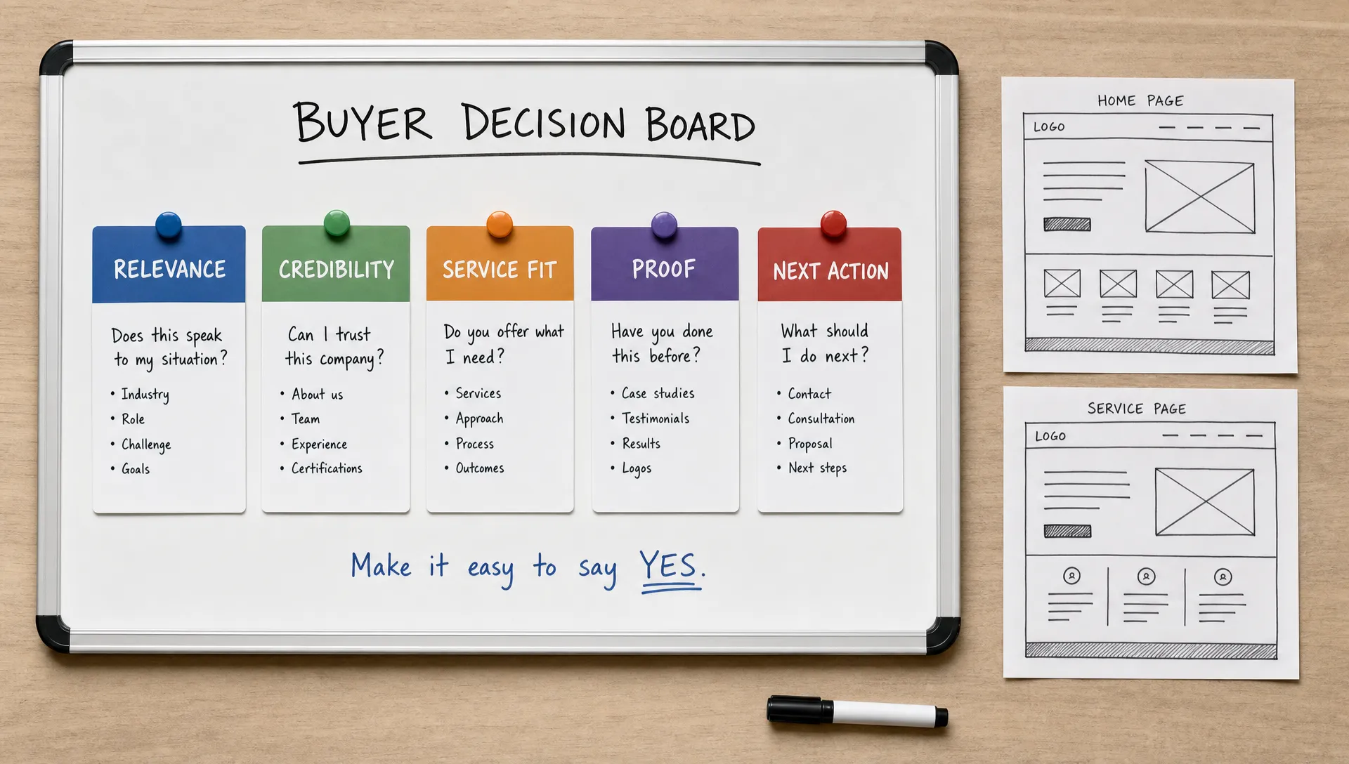
Visual design should support the decision path.
A well-designed business website makes content easier to evaluate. It uses hierarchy, spacing, contrast and consistent components to guide attention. The design should help buyers understand what matters first, what supports it and what action to take next.
This does not mean the site should look plain. It means the visual system should serve clarity. A design that impresses internally but hides the offer, proof or next step creates friction.
Performance also affects confidence. Slow pages, layout shifts and poor mobile behavior can make the company feel less reliable. Google's page experience guidance is a useful reference when reviewing technical quality, especially for mobile usability and loading behavior.
These mistakes usually appear when teams build from internal preferences instead of buyer decisions. The table below groups the most frequent ones with what to do instead.
| Mistake | Why it hurts conversion | What to do instead |
|---|---|---|
| Starting with visual references before strategy | Design choices end up driving structure instead of supporting it | Decide the buyer journey, page roles and content needs first |
| Making the homepage carry every message | Trying to convince everyone at once makes the page unfocused | Use it to route buyers to the right deeper page |
| Writing service pages as internal descriptions | Buyers care about fit, not internal categorization | Explain the problem solved, the method and who it suits |
| Using vague proof | Generic testimonials and logos carry little weight alone | Add context: what was delivered, what constraint existed, why it is relevant |
| Hiding process information | Buyers hesitate when they cannot picture working with you | Explain the process briefly, without a long writeup |
| Treating SEO as an afterthought | Retrofitting structure and content after launch creates extra work | Plan structure, intent and technical setup before launch |
| Overloading calls to action | Too many competing actions reduce clarity | Give each page one main action and, if useful, one lower-intent alternative |
If these issues already exist on your current site, a redesign may be more practical than small edits. BeBranded's complete guide to website redesign outlines what to review before changing structure, content or design.
Use this checklist before development starts. It is designed for founders, CEOs and marketing teams who want a cleaner build process. BeBranded's pre-launch checklist covers the technical side in more detail if you need a companion reference.
| Checklist item | Why it matters |
|---|---|
| Define the primary buyer | Avoid designing for every possible visitor equally |
| List the main buyer decisions | Clarifies what the visitor must believe or compare before contacting you |
| Assign a role to every page | Each page should have one job in the decision journey |
| Map one primary action per page | Keeps intent and next step aligned instead of competing |
| Prepare proof before design | Examples, testimonials and process detail take time to collect |
| Write page outlines before final copy | Structures the argument before language is refined |
| Plan navigation around buyer intent | Labels should match how visitors think, not internal service names |
| Check mobile decision paths | Offer, proof and call to action must stay clear on smaller screens |
| Define CMS needs | Clarifies what the team must update after launch |
| Set SEO basics before launch | Titles, meta descriptions, redirects and hierarchy are easier to plan upfront |
| Decide what to measure | Signals should connect to business outcomes, not only traffic |
| Document ownership after launch | Clarifies who updates content, reviews performance and maintains the site |
A checklist does not replace strategy, but it prevents common execution gaps. It also helps align marketing, leadership and external partners before the project becomes expensive to change.
Not every business needs a full redesign. The right decision depends on how much of the current website still supports buyer decisions. The table below summarizes the signals that point toward each option.
| Signal | Build new or rebuild structure | Targeted redesign |
|---|---|---|
| Brand and offer | Outdated or no longer accurate | Still accurate and well received |
| Information architecture | Confusing, outdated or missing key pages | Sound, but individual pages underperform |
| Conversion | Weak across most of the site | Weak on specific pages such as forms or service pages |
| Typical scope | Rewrite key pages, rebuild structure, update the visual system | Improve high-intent pages, forms, proof and mobile performance |
Choosing the right partner also depends on your stage. A startup validating a new offer does not need the same process as a scale-up with multiple stakeholders, SEO risk and complex CMS needs. BeBranded's guide on how to choose a web design agency that fits your growth stage explains how to evaluate scope, support and operating style.
What does it mean to build your business website around buyer decisions? It means planning pages, content, proof and calls to action around the questions buyers need answered before they take the next step. The website is structured around how people evaluate, not only around what the company wants to say.
How do I know which buyer decisions matter most? Start by reviewing sales calls, customer questions, objections and reasons deals are delayed. The most important decisions are usually about relevance, trust, fit, risk, timing and next steps.
Should every page have a call to action? Yes, but not every call to action needs to be the same. A high-intent service page may invite buyers to request a call, while an educational article may guide them to a related service page or resource.
Is a decision-led website only for B2B companies? No. Any business website can benefit from decision-led planning. It is especially useful for B2B services, agencies, consultants, software companies and teams with longer sales cycles.
Can I apply this approach to an existing website? Yes. Audit each key page and ask what decision it supports, what evidence it provides and whether the next step is clear. If major pages do not support buyer decisions, update structure and content before changing visuals.
A business website works better when every page has a clear decision to support. Start with buyer questions, assign each page a role, match proof to risk and make the next action obvious.
The clear next step is to audit your current homepage and main service page against the five-part framework above. If you want a Webflow or Framer website built with that decision-led approach, BeBranded can help you turn the strategy into a clean, conversion-focused build.