A design system that keeps your product consistent and fast to ship.

When every screen is designed from scratch, quality drifts and speed dies. We build a design system, the components, rules and tokens your team reuses, so your product stays consistent and every new page ships faster.
Your situation

When your product looks like five people built it.
A missing design system does not shout, it drifts. If these signals sound familiar, a system pays for itself in speed and consistency.
Buttons, spacing and colours vary from page to page, because there is no shared source. It reads as amateur and erodes trust.
Slow to build
Design and dev out of sync
Hard to scale
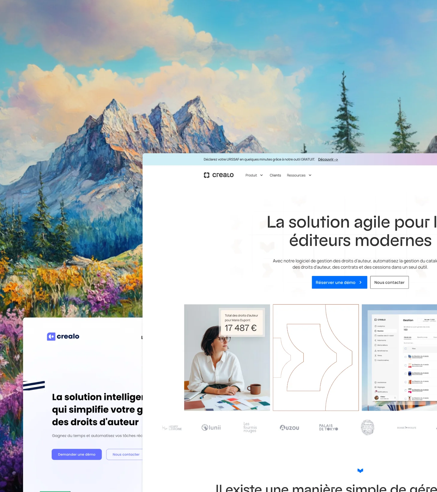
crealo before after - redesign image
Our expertises

From tokens to a living, documented system.

One team designs the system and builds it into the tools your product runs on.

Consistency, made the default

One team designs the tokens, components and rules, then builds them into the tools your product runs on. Every new screen ships faster and stays on brand, without reinventing the wheel each time.
You cannot systematise what you have not mapped. We audit your existing screens and styles to surface the inconsistencies that have crept in over time, then define the foundations the system will stand on. We agree the scope, the priorities and the guiding principles up front, all aligned with your brand. You start with a clear picture of where you are and where the system needs to go.
  • Audit of your current screens and styles
  • Inconsistencies mapped across the product
  • Foundational principles agreed together
  • Scope and priorities set clearly
  • Everything aligned with your brand
You cannot systematise what you have not mapped. We audit your existing screens and styles to surface the inconsistencies that have crept in over time, then define the foundations the system will stand on. We agree the scope, the priorities and the guiding principles up front, all aligned with your brand. You start with a clear picture of where you are and where the system needs to go.
  • Colour, type and spacing tokens defined
  • Light and dark modes handled when needed
  • Consistent scale across the whole product
  • One change updates the value everywhere
  • Ready to use in Figma and in code
A system pays off when your team assembles pages instead of rebuilding them. We design the components and patterns with every state and variant, from hover to error to empty, so nothing has to be reinvented. Common patterns are documented and accessibility is built in from the start. Everything is made to be composed into new screens quickly.
  • Reusable components with their variants
  • Every state designed: hover, error, empty
  • Common patterns documented for reuse
  • Accessible by default, not as an afterthought
  • Built to be composed into pages
Components without rules drift the moment the team grows. We document how and when to use each part, in plain language your whole team understands, so the system guides decisions instead of gathering dust. Naming is clear, dos and don'ts are explicit, and new joiners get up to speed fast. We keep it practical rather than academic.
  • Usage rules documented per component
  • Dos and don'ts made explicit
  • Naming everyone on the team understands
  • Easy for new joiners to pick up
  • Kept practical, never academic
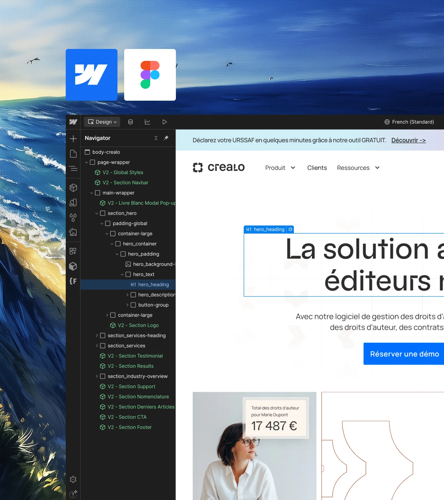
A system only delivers value once it lives where the work happens. We build it into Webflow or Framer and connect it back to your Figma library, so design and build stay in sync. Reusable classes and components keep every page consistent, and your team can extend it without breaking things. It becomes part of your workflow, not a document nobody opens.
  • Built directly into Webflow or Framer
  • Connected to your Figma library
  • Reusable classes and components throughout
  • Consistent across every page
  • Easy for your team to extend safely

A design system is a product, not a style guide.

A design system is often confused with a colour palette and a logo file. That is a brand guide. A design system goes further: it is the set of reusable components, patterns, tokens and rules that a team actually builds with. It is less a document and more a working toolkit, the single source of truth that keeps design and development speaking the same language.


Its real value is speed and consistency at once, which usually pull in opposite directions. With a system, a new page is assembled from parts that are already designed, tested and built, so it ships fast and looks right by default. Without one, every screen is a fresh negotiation between design and dev, and quality drifts a little more each time.


We build the system around how you actually work. Design tokens for colour, type and spacing, so a change updates everywhere at once. Components with their states and variants, so nothing is improvised. And clear rules for when to use what, so the system guides decisions instead of just storing them.


And we build it to live in your tools, not a PDF. In Figma for design, and in Webflow or Framer for the build, connected so the system is used, not admired. A design system only pays off if it is the thing people reach for every day.

Why choose 

3 good reasons to trust BeBranded with your site

1. A multi-skilled team, not just developers

Design, SEO, CRO, advanced Webflow development, automation… You get access to every skill you need without juggling multiple providers.

2. Certified Webflow Partner, Client-First methodology

Our code follows Client-First, the industry standard naming convention. Your site is scalable, maintainable and easily picked up by any Webflow developer.

3. A real partner, not just a service provider
We don't count hours, we align with your goals. Monthly reporting, strategic recommendations and constant availability.
Crealo project image
case studies

Design that makes the difference.

A few projects taken from mockup to live site, approved without friction.
Coudac
8
CMS pages refactored
Discover how BeBranded transformed Coudac's website with an autonomous Case Studies system and a fully optimized conversion funnel across every page.
Read the use case
Elmut
+25
variants
Discover how BeBranded built high-performing landing pages for Elmut, giving the team autonomy and speed to power their online advertising campaigns.
Read the use case
Cenareo
+6 month
Partnership
Discover how BeBranded optimized Cenareo's Webflow website for speed, SEO and mobile, improving Core Web Vitals and navigation for this digital signage leader.
Read the use case
Testimonials

Real results, whatever the project.

FAQ

Is everything clear?

A brand guide covers logo, colours and tone. A design system goes further: reusable components, tokens, patterns and rules that a team builds with. One describes the brand, the other is a working toolkit.
If your product has more than a handful of screens, or more than one person designing or building, a system saves time and keeps quality consistent. For very small, stable sites it can be overkill, and we will tell you.
Both. We design the system in Figma and build it into Webflow or Framer, connected so design and build stay in sync.
Yes. We audit your current screens, extract what works, fix the inconsistencies and turn it into a coherent system without starting from scratch.
Yes. We document the rules clearly and keep the system practical, so your team can use and extend it without us.
Expect two to four weeks for an identity or a page, more depending on the size of the site or app. We set a clear schedule at the start, with approval milestones. Timelines depend mostly on how quickly you send feedback.
Yes. Webflow's classes and components map naturally to a design system, and Client-First keeps it clean and maintainable.
Max
Roland
You can always contact us
Because we love discussing your projects with you, don't hesitate to contact us, even if it's just to say hello!

Ready to make consistency the default?

A few projects taken from mockup to live site, approved without friction.