
The essentials · 30-second read
Responsive is not accessible: test the published output of a builder before you choose it.
- Build a realistic trial page on the plan you would buy, with your real navigation, forms, CMS content and third-party tools.
- Check it against WCAG 2.2 AA: keyboard and focus, reflow at 320 CSS pixels, text at 200%, contrast, 24 pixel targets, form errors.
- Combine an automated scanner with manual and screen reader tests: the W3C says no tool alone can determine accessibility.
- Decide pass, repair or reject per journey, and confirm that fixes made at component level survive routine content changes.
Summarize this article with AI
To test a responsive website builder for accessibility, publish a realistic trial page on the plan you would actually buy, then check it against WCAG 2.2 Level AA with a keyboard, browser zoom, a contrast checker, a screen reader and an automated scanner. The builder passes only if essential journeys work and your team can fix the failures you find at component level, then keep them fixed when content changes.
A layout that fits a phone screen can still block keyboard users, hide form errors or read in the wrong order. Treat this as a procurement exercise, not a prelaunch inspection: the goal is to find problems while you can still change the template, the implementation approach or the platform.
Why responsive does not mean accessible
Responsive design and web accessibility overlap, but they solve different problems.
| Responsive design | Accessibility | |
|---|---|---|
| Question it answers | Does the layout adapt to the available space? | Can people with different sensory, motor and cognitive needs perceive and operate the content? |
| Typical failure | Horizontal scrolling, overlapping blocks on small screens | A mobile menu that resizes correctly but cannot be opened with a keyboard |
| Reference | Breakpoints and fluid layouts (see our guide to responsive design) | WCAG 2.2 success criteria, Level AA as the usual target |
| How you check it | Resize the viewport, test real devices | Keyboard, zoom, contrast measurement, screen reader, automated scan |
The gap is large in practice. In its 2026 analysis of the top one million home pages, WebAIM found detectable WCAG 2 failures on 95.9% of them, with low contrast text on 83.9% and missing form input labels on 51%. Those are only the failures a tool can detect automatically.
Use WCAG 2.2 Level AA as your technical baseline. Testing representative pages against selected criteria identifies risks, but it does not establish whole-site conformance or legal compliance.
How to test a responsive website builder before committing
Use a four-stage method: build, test, repair and repeat. It separates a convincing demonstration from a platform your team can operate reliably.
- Build a representative page on the intended plan, with real components and content.
- Test complete user journeys on the published page, at desktop and mobile sizes.
- Repair the failures at component level and record who made each fix.
- Repeat the failed checks after ordinary content changes.
Record each issue with its location, reproduction steps, user impact and proposed owner. Screenshots help with visual failures; keyboard and screen reader problems also need a written sequence describing what happened.
Build a realistic trial page
Test the kind of website you intend to publish, with realistic content, on the subscription plan you would buy. Include:
- the main navigation, including the mobile menu;
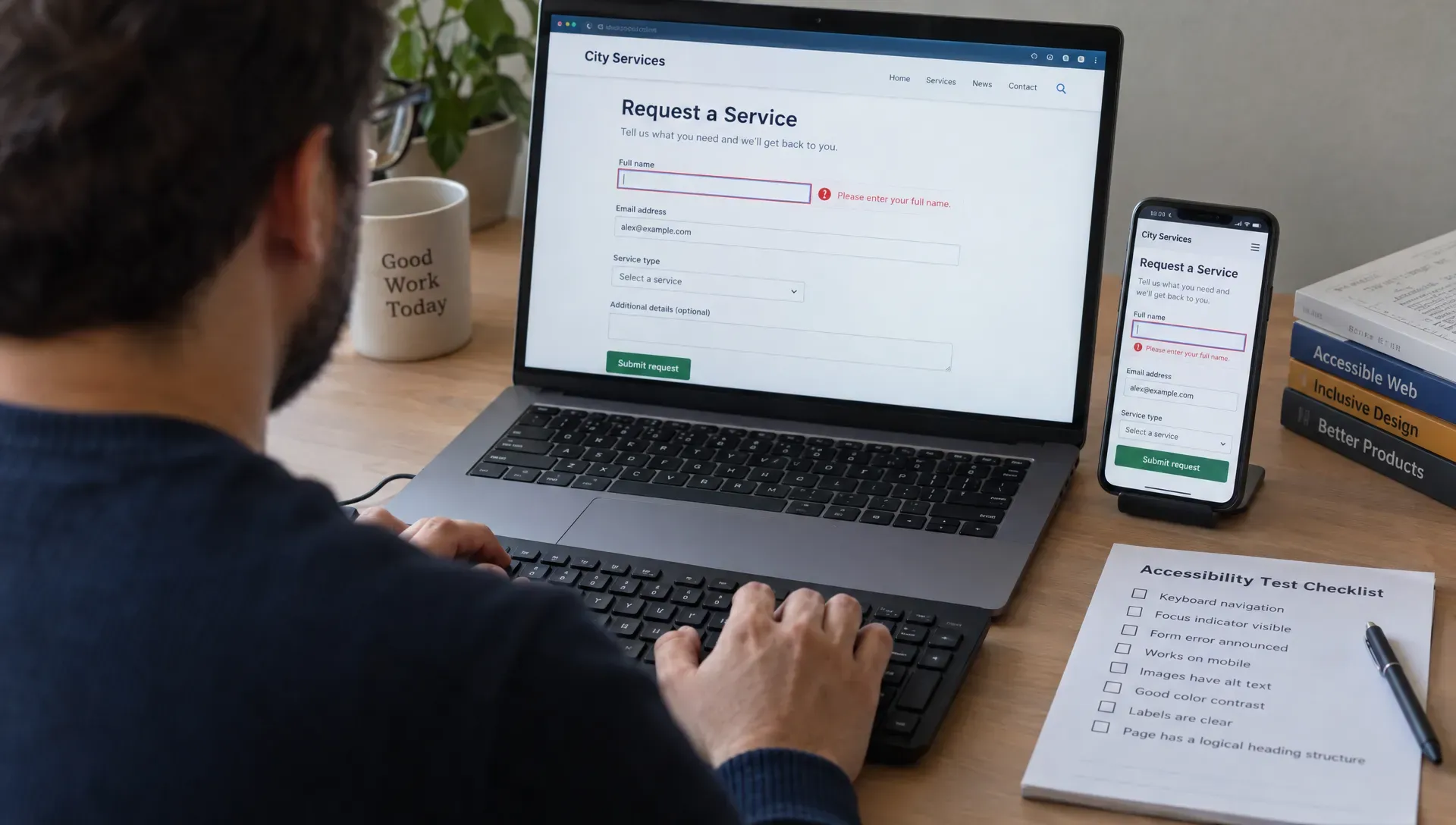
- a lead form with required fields and validation errors;
- a CMS-driven section with long titles and longer button labels;
- images, and any interaction central to conversion (tabs, accordion, modal);
- third-party elements you depend on: booking widget, cookie banner, embedded form.
A clean template cannot reveal problems introduced by production components. Publish to a staging address rather than relying only on the editor preview. If a trial restricts publishing, scripts or component editing, ask for a demonstration under equivalent conditions.
Define pass, repair and reject decisions
Agree on acceptance rules before reviewing the results.
| Decision | Condition | Example |
|---|---|---|
| Pass | The tested task works under the documented conditions | The enquiry form can be completed and corrected with a keyboard only |
| Repair | The failure has a feasible fix, an owner and a successful retest | Focus outline removed by the template, restored in the global styles |
| Reject | An essential journey stays blocked and no maintainable repair exists | The mobile menu cannot be operated by keyboard and its markup cannot be edited |
One blocked enquiry form matters more than several minor presentation issues. The deciding question is often whether a fix can be made once, at component level, or requires repeated page-by-page work. If an agency will build the site, include accessibility ownership and evidence in your evaluation of professional website services.
Run accessibility tests on the published site
Start with complete user tasks, then inspect the components that support them. For a marketing site, a useful journey is: find a service, open the navigation, submit an incomplete enquiry and correct the errors. Run it at desktop and mobile sizes, and keep viewport and browser coverage aligned with your prelaunch responsive QA process.
| Check | WCAG 2.2 criterion | What passes |
|---|---|---|
| Keyboard operation | 2.1.2 No Keyboard Trap, 2.4.7 Focus Visible | Every control reachable with Tab, focus always visible, no trap |
| Focus not hidden | 2.4.11 Focus Not Obscured (Minimum) | Sticky headers and banners never fully cover the focused element |
| Reflow | 1.4.10 Reflow | No two-dimensional scrolling at 320 CSS pixels wide |
| Text resizing | 1.4.4 Resize Text | Text at 200% without loss of content or functionality |
| Text contrast | 1.4.3 Contrast (Minimum) | 4.5:1, or 3:1 for large text |
| Non-text contrast | 1.4.11 Non-text Contrast | 3:1 for control boundaries, states and meaningful graphics |
| Target size | 2.5.8 Target Size (Minimum) | 24 by 24 CSS pixels, or enough spacing |
| Form errors | 3.3.1 Error Identification | The field in error is identified and the error described in text |
Check keyboard navigation and focus
Put the mouse aside and operate the page with the keyboard:
- Tab and Shift+Tab move between controls;
- Enter activates links, Enter or Space activates buttons;
- arrow keys move within composite widgets such as tabs, as described in the W3C keyboard interface practices;
- Escape closes an open dialog or menu.
Focus should remain visible, follow a meaningful order and never become trapped. Open the mobile menu and any modal: hidden controls should not be reachable, focus should move into the overlay, and closing it should return users to a sensible place. Sticky headers and cookie banners must not conceal the focused control. Document the first blocked step, not simply that keyboard navigation failed.
Test reflow and text resizing separately
A layout that looks correct at a few preset breakpoints can still fail when users enlarge content.
Check ordinary page content at a viewport width of 320 CSS pixels. WCAG reflow expects vertically scrolling content to work without scrolling in two dimensions at that width, except for content that genuinely needs a two-dimensional layout, such as some data tables. The W3C notes that 320 CSS pixels is equivalent to a 1280 pixel wide desktop viewport at 400% zoom, which gives you a second way to test it.
Then test text resizing to 200%. Look for clipped headings, overlapping labels and missing controls: they show whether the builder output depends on fixed heights or fragile positioning. Inspect reading order too. Visually moving a card or sidebar should not make the underlying sequence confusing.
Measure contrast and target sizes
Use a contrast checker rather than visual judgment. At Level AA, text needs a contrast ratio of at least 4.5:1, or 3:1 for large text. Visual information needed to identify controls and their states needs 3:1 against adjacent colours. Test hover, focus and error states as well as the default design, and check text over photography against its actual background.
For pointer targets, WCAG 2.2 sets a minimum of 24 by 24 CSS pixels, with exceptions when undersized targets have enough spacing. Inspect crowded navigation, icon buttons and inline actions, then confirm on a real phone.
Verify semantics and screen reader output
Use a screen reader, such as NVDA (free, on Windows) or VoiceOver (built into Apple devices), to move through headings, links, landmarks and form fields. Confirm that:
- controls have useful accessible names and announce their expanded or collapsed state;
- navigation links and action buttons use the right element;
- form fields keep visible labels, errors identify the affected field and instructions do not rely on colour alone;
- images have relevant text alternatives and CMS-generated headings follow a logical hierarchy.
A short screen reader session reveals obvious barriers, but a tester new to the software should not treat a first successful walkthrough as a complete audit.
What is the best tool for accessibility testing?
No single tool. The W3C is explicit that no tool alone can determine whether a site meets accessibility standards, and that knowledgeable human evaluation is required. Combine methods:
| Method | Examples | Finds well | Misses |
|---|---|---|---|
| Automated scanner | WAVE, axe DevTools | Missing labels and alt text, contrast failures, empty links and buttons | Reading order, quality of alternatives, whether a journey can be completed |
| Keyboard test | Tab, Shift+Tab, Enter, Space, Escape | Traps, invisible focus, unreachable controls | What screen reader users hear |
| Zoom and reflow | Browser zoom, 320 pixel viewport | Clipped text, overlaps, horizontal scrolling | Semantic problems |
| Screen reader | NVDA, VoiceOver | Names, roles, states, heading structure | Visual contrast issues |
| Testing with users | Sessions with disabled participants | Real barriers and workarounds | Exhaustive criterion coverage |
Run the scanner against the published page, and again with menus open and errors visible, since a first scan may miss them. Treat findings as evidence to confirm manually: the W3C guide to selecting evaluation tools warns that tools can produce false or misleading results. Keep these checks separate from your website builder SEO evaluation: an SEO score is not evidence of accessibility.
Confirm that fixes survive content changes
An accessible trial page is not enough if routine publishing reintroduces the same failures. After a repair:
- reuse the corrected component on another page;
- publish a CMS entry with a longer title, replace an image and change a button label;
- repeat the checks that failed.
This shows whether accessibility lives in a reusable component or in manual adjustments editors must remember. Also test with the access level your marketing team will use: can an editor add image alternatives, keep the heading structure and update a label without a developer? If colleagues with disabilities will edit the site, assess the accessibility of the editing interface separately.
A builder becomes risky when essential fixes require fragile scripts or repeated exceptions. Custom code is not a problem in itself, but it needs an owner, documentation and regression tests. Our guide to no-code platform limitations gives a broader way to assess that maintenance burden.
Mistakes that distort the evaluation
| Mistake | Why it misleads | Do instead |
|---|---|---|
| Testing only the homepage | Navigation, CMS templates and forms behave differently elsewhere | Include representative templates and complete journeys |
| Treating a scanner score as a pass | Automated checks cover only part of WCAG | Confirm with keyboard, zoom and screen reader tests |
| Accepting a badge or overlay as proof | A widget does not fix the underlying markup | Repair the implementation and retest |
| Ignoring third-party content | A booking tool or consent banner can block the journey | Test embedded tools inside the journey |
| Approving an unverified workaround | A proposed fix is not a working fix | Publish it and repeat the failed steps |
Distinguish platform constraints from template, integration and implementation defects. Reproduce a suspected constraint on a minimal page before rejecting the platform. Conversely, do not dismiss a failure as just the template if that template is what your team will maintain.
Accessibility acceptance checklist
- Scope recorded: tested pages, components, journeys, browsers, devices and WCAG criteria.
- Keyboard journey completed: essential tasks work with visible focus and no traps.
- Responsive behaviour verified: reflow at 320 CSS pixels and text at 200% without loss of content or functionality.
- Visual checks completed: contrast measured, target sizes and interaction states inspected.
- Semantics and forms reviewed: headings, accessible names, labels, errors and reading order.
- Integrations included: menus, consent tools, embedded forms and other essential third-party components.
- Repairs demonstrated: fixes published, failed steps repeated, reusable components updated.
- Ownership agreed: owners for unresolved issues, content guidance and regression checks.
Attach the results to the project’s launch deliverables and handover, and label untested areas explicitly. A recorded limitation is more useful than an unsupported claim that the site is accessible.
How BeBranded approaches accessibility testing
BeBranded is an agency that starts with consulting, then builds: custom sites in Next.js and Payload, Webflow or Framer when they are the right fit, plus AI, apps and automation. We treat accessibility as part of the build, not a final scan. On our website projects, design is checked on real devices, contrast and text sizes are set against WCAG criteria, and keyboard navigation, semantic structure and alt text are part of delivery. To scope a test for your own project, book a call with us.
Sources
- 1. W3C: Web Content Accessibility Guidelines (WCAG) 2.2 · w3.org/TR/WCAG22/
- 2. W3C WAI: Evaluating Web Accessibility Overview · w3.org/WAI/test-evaluate/
- 3. W3C WAI: Selecting Web Accessibility Evaluation Tools · w3.org/WAI/test-evaluate/tools/selecting/
- 4. WebAIM: WAVE Web Accessibility Evaluation Tool · wave.webaim.org/
- 5. WebAIM: The WebAIM Million, 2026 report · webaim.org/projects/million/
- 6. W3C: Understanding SC 1.4.10 Reflow · w3.org/WAI/WCAG22/Understanding/reflow.html
- 7. W3C: Understanding SC 1.4.3 Contrast (Minimum) · w3.org/WAI/WCAG22/Understanding/contrast-minimum.html
- 8. W3C: Understanding SC 2.5.8 Target Size (Minimum) · w3.org/WAI/WCAG22/Understanding/target-size-minimum.html
- 9. W3C WAI-ARIA APG: Developing a Keyboard Interface · w3.org/WAI/ARIA/apg/practices/keyboard-interface/
- 10. NV Access: About NVDA · nvaccess.org/about-nvda/