Design a website around the decisions buyers need to make
Development
•
X min
•
Published on
07.09.2026
•
Updated on
10.09.2026

A website should help buyers make progress. If it only presents your company, services and visual identity, it can look polished without helping a prospect decide whether to trust you, shortlist you or contact you.
If you want to design a website that supports revenue, start with the decisions buyers need to make. Then use pages, copy, design, proof and calls to action to reduce uncertainty at each step.
This article gives you a practical decision-led framework, common mistakes to avoid and a checklist your team can use before opening Figma, Webflow or Framer.
Decision-led website design starts with buyer uncertainty.
A buyer does not land on your website thinking, “I want to explore this company’s navigation.” They usually have a question. They want to know if you understand their problem, if your offer fits their situation, if your team can deliver and what the next step requires from them.
To design a website around those moments, you need to move from a company-first structure to a buyer-first structure. The site still needs to explain who you are, but every major page should help the visitor answer a specific decision question.
A useful definition is simple: decision-led website design is the practice of structuring a website around the choices a buyer must make before taking action. It connects strategy, content, UX and conversion instead of treating them as separate workstreams.
For growing teams, this connects directly to the broader question of what to prioritize in website design and development, especially when the website needs to support sales, SEO and content operations at the same time.
The difference is easier to see side by side. A company-first site organizes itself the way the business is organized internally. A buyer-first site organizes itself the way a prospect actually thinks while trying to solve a problem.
| Structural approach | What it centers on | Typical outcome for buyers |
|---|---|---|
| Company-first structure | Departments, service lines and the internal org chart | Buyers have to translate your structure into their own questions |
| Buyer-first structure | The decisions a buyer needs to make, in order | Buyers find the page that matches where they are in the decision |
| Company-first navigation | Labels such as "About," "Solutions" or "Resources" with no priority | Visitors have to guess which link answers their question |
| Buyer-first navigation | Labels tied to buyer intent: problem, fit, proof, next step | Visitors self-select into the right path within one or two clicks |
Most website projects start with a sitemap too early.
A sitemap is useful, but only after you know what each page is meant to resolve. When teams skip that step, the website often becomes a list of internal departments, not a guided path for the buyer.
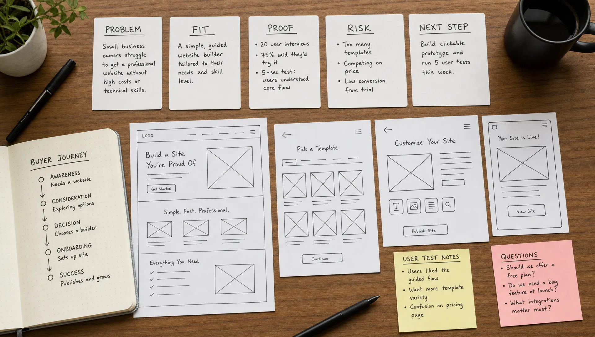
Before you design a website, map the buyer decisions in order. For a B2B service business, the core decisions and the question behind each one usually look like this.
| Decision | Core question | What buyers look for |
|---|---|---|
| Problem | Is this problem worth solving now, or can it wait? | Cost of inaction, urgency signals, relatable examples |
| Category | Is this type of solution the right way to solve it? | Comparisons with alternative approaches and their trade-offs |
| Fit | Is this provider relevant for our size, goals and constraints? | Case studies, industry context, a clearly scoped service |
| Trust | Can this team deliver what they claim? | Proof, credentials, process transparency, client outcomes |
| Risk | What could go wrong during the project or after launch? | Guarantees, process detail, support terms, maintenance plans |
| Action | What should we do next, and what happens after that step? | A clear call to action, next-step expectations, response time |
This sequence is not always linear. A founder may jump straight to proof. A CMO may compare positioning. A marketing manager may check CMS flexibility and implementation details. Your website should support all of them without forcing every visitor through the same path.
If the website is part of a larger redesign, it helps to anchor this mapping in business goals first. BeBranded’s guide on planning a website revamp around business outcomes covers that upstream work in more detail.
Every page should have a job beyond “share information.”
Once you know the decisions, assign each page a role. The homepage should orient. Service pages should qualify and persuade. Case studies should reduce risk. Pricing or process pages should remove friction. Resource pages should help visitors understand the category and evaluate their options.
A common mistake is expecting one page to do everything. The homepage cannot explain every use case, prove every claim, answer every objection and convert every visitor with the same intensity. Its job is to create enough clarity for the buyer to choose a relevant next page. A decision-led page role might look like this.
| Page | Primary role | Signal the page is doing its job |
|---|---|---|
| Homepage | Orient visitors and route them to the right next page | Visitors reach a relevant deeper page within one click |
| Service page | Help qualified buyers evaluate fit, scope and outcomes | Fewer repetitive questions during the first sales call |
| Case study page | Reduce risk with evidence and delivery context | Prospects reference specific results during discovery calls |
| About page | Build credibility and show team and operating style | Buyers mention trust or culture as a reason to proceed |
| Resource page | Help buyers clarify a problem before talking to sales | Organic traffic converts into qualified conversations |
| Contact page | Set expectations for what happens after a form is submitted | Lower drop-off between form submission and first call |
This is where structure matters. If you are still at the planning stage, start with a clear hierarchy before design decisions. The article on starting a website with the right structure explains how to organize core pages before development begins.
Copy should help buyers make a judgment.
Many websites use copy to describe the company. That is necessary, but not enough. Buyers need to understand what problem you solve, what makes your approach relevant and what tradeoffs come with choosing you.
Useful website copy answers the questions sales teams hear repeatedly. For example: “Is this suited to our stage?” “How long does implementation take?” “What do we need to prepare?” “Will this work with our existing tools?” “How much input will our team need to provide?”
When you design a website around decisions, copy becomes more specific. Instead of saying “We build custom websites for ambitious brands,” a stronger section explains who the service is built for, what situations it solves and what a project typically includes.
Avoid vague claims that buyers cannot verify. Words like “premium,” “innovative” and “full-service” rarely help a visitor decide unless they are supported by concrete details, proof or process.
Visual design should make decisions easier.
A strong layout helps visitors scan, compare and understand priority. That matters because people rarely read business websites from top to bottom. Nielsen Norman Group’s research on how users read on the web has shown for years that users scan pages, pick up cues and focus on information that looks relevant to their task.
For a conversion-focused site, design choices should support comprehension. Headings need to be specific. Sections should follow a clear order. Calls to action should appear where the visitor has enough context to act. Proof should be close to the claim it supports, not hidden in a separate testimonial carousel.
Above-the-fold clarity matters more than most teams expect. Visitors decide within seconds whether a page is relevant to them, so the first visible section should state who the page is for and what problem it addresses, without requiring a scroll to find that context.
Design can also reduce perceived effort. A short form with clear expectations feels easier than a generic “contact us” page. A process section with concrete steps makes a service easier to buy. A CMS-driven resource library with clear categories makes expertise easier to evaluate.
If your team is deciding which design and UX work will actually affect performance, this breakdown of web design services that improve conversion and SEO can help separate useful work from cosmetic extras.
Use this framework when you need a clear method.
A decision-first framework turns each buyer decision into content, layout and conversion requirements. It keeps the project from drifting into subjective debates about what looks better without discussing what helps the buyer move forward. Each step of the framework has a specific output your team can check against.
| Step | What to define | Example |
|---|---|---|
| Decision | The buyer decision this page or section supports | Trust decision on a service page |
| Question | The exact question the buyer needs answered | "Can this team handle a project like ours?" |
| Evidence | The proof or explanation that answers it | A case study with a comparable company size or industry |
| Interface | Where and how the answer appears on the page | A proof block placed right after the service description |
| Action | The next step that makes sense once the question is answered | A scoped consultation call, not a generic "contact us" |
This method is simple enough to use in a workshop with leadership, marketing and sales. It also gives designers and developers a clearer brief. Instead of asking them to “make the page more premium,” you ask them to make a specific decision easier.
A decision-led way to design a website also improves internal alignment. Teams can challenge page elements based on their purpose, not personal taste. If a section does not answer a decision question, support a search intent or guide the next action, it probably needs to change.
Navigation is a decision tool, not just a menu.
Buyers use navigation to understand what kind of company they are dealing with. A clear menu tells them what you offer, who you serve, what proof exists and how to take action. A cluttered menu makes the company feel harder to evaluate.
Your main navigation should separate decision paths clearly. A buyer comparing services needs a different route from someone validating your credibility. A marketing manager looking for resources should not have to guess whether insights are under “blog,” “resources,” “learn” or “academy.”
This is also where SEO and UX overlap. A clear structure helps visitors find the right page and gives search engines stronger signals about page relationships. BeBranded’s article on website structure for users and Google covers this relationship in practical detail.
A decision-led site still needs solid execution.
If pages load slowly, layouts break on mobile or content teams cannot update pages without developer support, the buyer experience suffers. Technical execution is not separate from decision-making. It affects trust, usability and the team’s ability to improve the website after launch.
Google’s SEO starter guide is clear that search performance depends on making pages understandable for both users and search engines. For business websites, that means clean structure, useful content, descriptive titles, crawlable pages and a technical setup that does not block growth.
Platform choice matters here. Webflow, Framer, WordPress and custom builds each come with tradeoffs around CMS control, performance, integrations and maintenance. If your next project involves a platform decision, review how to choose a website development platform for B2B growth before committing.
A decision-led redesign is not finished at launch. The real test starts once real buyers use the site.
Track the signals that map back to the decisions you designed for. Time on service pages tells you whether qualified buyers slow down to read fit details. Scroll depth on case studies shows whether proof gets consumed or ignored. Form completion rate and time to first response show whether the action decision feels safe. A drop at a specific page usually points to a missing answer rather than a design flaw.
Review this data on a fixed cadence rather than reacting to every weekly fluctuation. A monthly review is usually enough to catch a real pattern without overreacting to normal noise in the numbers.
Decision-led design is as much about what you remove as what you add.
Many websites underperform because they create friction at the exact moment the buyer needs clarity. These mistakes are common in redesigns, early-stage websites and mature sites that have accumulated pages over time.
| Mistake | Why it creates friction | What to do instead |
|---|---|---|
| Starting with visual references instead of buyer decisions | Taste replaces strategy, so the site looks fine but resolves nothing | Map the decisions first, use references only to calibrate style |
| Making the homepage carry the full sales argument | Visitors get overwhelmed instead of routed | Let the homepage orient, push proof and detail to deeper pages |
| Using generic proof | Logos and testimonials without context do not answer a specific doubt | Tie each proof point to a claim, use case or objection |
| Hiding process details | Buyers hesitate to book a call when the process feels opaque | Explain how work happens before asking for commitment |
| Treating mobile as a resize task | Hierarchy and proof get lost when layouts are only shrunk | Rebuild decision clarity for mobile, not just fit the screen |
| Adding too many calls to action | Competing buttons create noise instead of a clear next step | Give each CTA a distinct, deliberate role |
| Designing pages the content team cannot maintain | The site becomes outdated because updates are too hard | Match CMS complexity to what the team can realistically manage |
It is possible to design a website that looks refined but still leaves buyers unsure. The goal is not only visual quality. The goal is clarity, trust and a logical next action.
A short checklist can prevent expensive rework.
Use this before wireframes, visual concepts or platform implementation. It is especially useful when leadership, marketing and sales all have input on the website.
| Checklist item | Why it matters |
|---|---|
| Have we defined the primary business goal of the website? | Every later decision should trace back to this goal |
| Have we listed the main buyer types and what each one needs to decide? | Different buyers need different evidence and pacing |
| Have we identified the top questions sales hears before a buyer converts? | These questions are the most reliable content brief you have |
| Have we assigned a clear role to every core page? | Pages without a role tend to drift into generic content |
| Have we mapped proof to the claims it supports? | Unattached proof reads as decoration, not evidence |
| Have we decided which pages need CMS control? | This affects both team autonomy and technical scope |
| Have we planned the main navigation around buyer paths? | Navigation is often the first decision point a visitor faces |
| Have we defined the primary and secondary calls to action? | Unclear CTA hierarchy leads to competing buttons |
| Have we removed pages or sections that do not support a decision? | Unnecessary pages dilute focus and slow maintenance |
| Have we checked whether the structure supports SEO and future content? | Structure decided late is expensive to redo later |
| Have we reviewed mobile layouts for decision clarity, not only visual fit? | A meaningful share of B2B traffic now happens on mobile |
| Have we agreed how performance will be measured after launch? | Without a baseline, you cannot tell if the redesign worked |
This checklist also helps your team decide what should be built now and what can wait. A website does not need every possible feature at launch. It needs the right structure, content and conversion paths for the decisions buyers are making today.
For teams expecting growth, the same logic applies after launch. The website should be able to evolve without rebuilding every few months. This is covered further in BeBranded’s guide on building a business website that can scale.
Decision-led planning makes no-code development more focused.
Webflow and Framer can both support fast, flexible website builds, but speed only helps when the strategy is clear. If page roles, CMS needs and conversion paths are vague, the project can still become slow or misaligned.
A better process starts with decisions, then moves into structure, wireframes, design and build. CMS collections should reflect how the company will publish and maintain content. Components should support reusable decision patterns such as proof blocks, process sections, comparison areas, FAQ sections and CTA bands.
For growing teams, this matters because the website is not a one-time asset. It becomes part of marketing operations. The article on website development in 2026 for growing teams explains why maintainability, speed and content ownership need to be part of the build conversation from the start.
What is the first step to design a website around buyer decisions? Start by listing the decisions a buyer must make before contacting you, such as understanding the problem, evaluating fit, trusting your proof and knowing what happens next.
How is decision-led website design different from normal web design? Normal web design often starts with pages, visuals or brand preferences. Decision-led design starts with buyer uncertainty and builds pages, copy and UX around reducing that uncertainty.
Do all websites need case studies to support buyer decisions? Not always, but most B2B websites need some form of proof. That can include case studies, testimonials, process details, client examples, measurable project context or clear explanations of how delivery works.
Can a small website still be decision-led? Yes. A small website can be effective if each page has a clear role and answers the main questions buyers need resolved before taking action.
Should SEO or conversion come first when planning pages? They should be planned together. A page needs to match search intent to attract the right visitor and support conversion intent once that visitor arrives.
How often should buyer decisions be reviewed after launch? Review them when your offer changes, your audience changes, sales objections shift or key pages stop performing. For active marketing teams, this is usually part of regular website optimization.
When you design a website around buyer decisions, the work becomes more practical. You stop debating isolated design preferences and start asking whether each page helps the right person make the next informed move.
The next step is to map your core buyer decisions before your next website project starts. If you want a focused Webflow or Framer website built around clear structure, SEO and conversion paths, BeBranded can help you turn that strategy into a clean, scalable build.