How to create a web page that moves visitors to action
Development
•
X min
•
Published on
21.09.2026
•
Updated on
16.10.2026
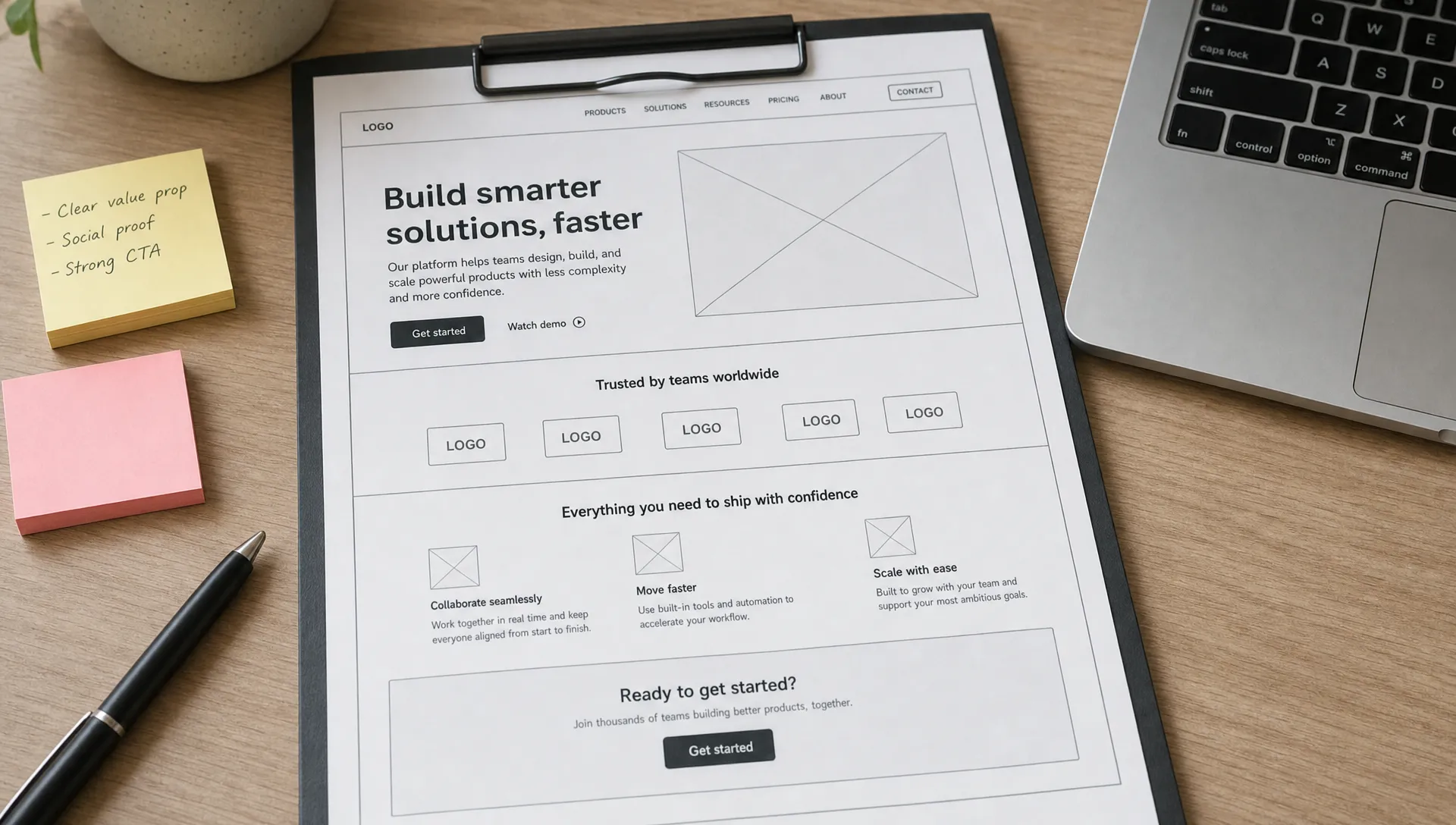
To create a web page that moves visitors to action, you need more than a clean layout. You need a page that answers the right question, removes hesitation, proves relevance and makes the next step obvious.
For CEOs, CMOs, founders and marketing managers, the page is not the project. The project is the decision you want the visitor to make. A page can look polished and still fail if the message is vague, the proof is weak or the action feels risky.
This guide gives you a practical framework to plan, write, design and review a web page before it goes live.
A web page converts when it helps a specific visitor make a specific decision.
That decision might be to book a call, request pricing, download a resource, start a trial or compare an offer. The page should not try to explain everything about your company. It should create enough clarity and trust for the next step.
A useful definition is simple: a web page is a focused decision path. Every section should either clarify the offer, make the value easier to understand, reduce perceived risk or guide the visitor toward the call to action.
If you are working on a broader site structure, it helps to start by designing pages around buyer decisions instead of organizing content only around internal teams, products or departments.
It also helps to check where the page sits in the site. A page that is hard to reach or poorly connected to its neighbors loses visitors before the message has a chance to work, which is why a website structure that helps users and Google find the right pages comes first.
Use this framework before wireframing or opening a design tool.
The method has five parts: goal, visitor, message, proof and action. If one of these is unclear, the page will likely create friction, even if the design is strong.
Start with one primary action. Do not set three equal priorities on the same page.
A pricing page can guide visitors to request a quote. A campaign landing page can collect demo requests. A service page can qualify leads. When you create a web page for one goal, your copy, layout and CTA choices become easier to evaluate.
A returning visitor who already knows your brand does not need the same message as a first-time visitor from paid search.
Write down what the visitor likely knows, what they doubt and what information they need before acting. This prevents the page from becoming a generic brochure.
Your core message should answer three questions quickly: what is this, who is it for and why should the visitor care now?
If the first screen only says something broad like “solutions for growth,” the visitor has to work too hard. Clear beats clever when the visitor is comparing options.
A high-performing page begins with constraint.
The safest way to create a web page is to choose one business goal, then translate it into one visitor decision. This prevents internal priorities from taking over the page.
For example, “generate more leads” is too broad to guide execution. “Convince marketing leaders to book a strategy call for a Webflow rebuild” is much more useful. It tells you what proof to show, what objections to address and what CTA wording to test.
A simple planning statement works well: this page helps a specific audience move from a current concern to a clear next action. If you cannot finish that sentence, pause before design.
Structure is where strategy becomes visible.
Most pages fail because the order of information is wrong. They show features before context, proof before the promise or CTAs before the visitor understands the value. A better sequence mirrors how people evaluate decisions.
Each block of the sequence answers one question that the visitor is silently asking. The table below pairs every block with that question and with the content that answers it, so you can audit an existing page or brief a designer without debating taste.
| Block | Question the visitor asks | Content that answers it |
|---|---|---|
| Outcome | What can I achieve here? | A headline built around the result, in the visitor's own words |
| Audience | Is this meant for me? | A short qualifier naming the role, company type or situation |
| Offer | What exactly do I get? | Scope, process, deliverables and what sets it apart from doing nothing |
| Proof | Why should I believe it? | Testimonials, examples or process details placed next to the claim they support |
| Action | What happens next? | One CTA with a concrete label and a short note on what follows |
If you create a web page for a landing page campaign, the same sequence still applies. The difference is focus: a campaign page should remove navigation choices and stay close to one promise. For more page-specific patterns, BeBranded has a guide on building a Webflow landing page that converts.
Copy should make the decision easier, not just describe the company.
Strong page copy is specific, concise and ordered by visitor priority. It should explain what changes for the visitor, what they get, why your approach is credible and what happens after they click.
A useful rule is to replace internal language with buyer language. “Scalable digital ecosystem” is usually weaker than “a Webflow site your marketing team can update without waiting on developers.” Specific wording helps visitors connect the page to their own situation.
To create a web page that supports conversion, review every section against one question: does this help the visitor move closer to action? If the answer is no, cut it, rewrite it or move it lower.
The CTA should describe the action, not just demand attention.
“Book a call,” “Request a quote,” “Get the checklist” and “Start the assessment” are clearer than vague labels such as “Submit” or “Get started” when the next step needs context. If you need a clear definition, BeBranded’s glossary explains the role of a call to action in conversion.
CTA placement also matters. Put the first CTA near the top only if the offer is already understandable. Otherwise, use the first screen to create clarity, then place the CTA after the value and proof are established.
The comparison below shows how a vague label can be rewritten so that it states the outcome of the click. Keep the same label across the page, so the visitor recognizes the action each time it appears.
| Vague label | Concrete label | Why it works better |
|---|---|---|
| Submit | Request a quote | States the result of the click |
| Get started | Book a 30-minute call | Sets expectations on time and format |
| Learn more | See how the process works | Promises a specific piece of information |
| Download | Get the launch checklist | Names what the visitor receives |
| Contact us | Ask about your project | Lowers the commitment while staying specific |
Design should support attention and comprehension.
A page that moves visitors to action usually has a strong visual hierarchy, readable spacing, clear section breaks and consistent CTA treatment. The goal is not to impress the design team. The goal is to help the visitor know where they are, what matters and what to do next.
Use contrast to highlight decisions, not to decorate every block. If every element is loud, the CTA loses weight. If every section has the same rhythm, visitors skim without understanding what is important.
Mobile design should be planned early, not fixed at the end. A section that looks balanced on desktop can become too long on mobile if the copy is heavy or the visuals stack poorly. BeBranded’s responsive design guide covers the breakpoints and layout rules that prevent this.

A persuasive page still needs sound implementation.
When teams create a web page quickly, technical details are often pushed to the end. That creates avoidable issues: slow loading, broken responsive behavior, missing metadata, inconsistent CMS fields or tracking that does not capture the main action.
At minimum, review performance, responsive behavior, accessibility basics, on-page SEO, forms, analytics events and thank-you states before launch. None of these elements will fix weak positioning, but each can damage conversion if ignored.
Speed deserves special attention, because visitors judge the page before they read it. The Core Web Vitals guide explains which loading and stability metrics to check first.
The table below summarizes the technical review in six areas. For each one, it states what to verify and what you risk if the check is skipped.
| Area | What to review | Risk if ignored |
|---|---|---|
| Performance | Image weight, fonts, scripts and loading of the first screen | Visitors leave before the message appears |
| Responsive behavior | Section length, stacking order and tap targets on mobile | The hierarchy breaks and the CTA gets buried |
| Accessibility | Contrast, heading order, form labels and keyboard focus | Part of the audience cannot complete the action |
| On-page SEO | Title, meta description, one H1, clean headings and internal links | The page attracts the wrong visitors, or none |
| Forms | Number of fields, error messages and confirmation state | Interested visitors abandon the form |
| Tracking | Form submissions, CTA clicks and thank-you page views | You cannot tell what works |
For Webflow or Framer projects, the build system should also make future changes practical. Marketing teams need reusable sections, clean CMS logic and pages that can evolve without becoming fragile after each campaign. For the search side of the build, the complete guide to SEO on Webflow details the settings worth configuring.
Launching the page is the start of the improvement cycle, not the end.
Track one primary conversion rate, the click rate on the main CTA, the form completion rate and the traffic source. Compare results by source, because visitors from search, paid campaigns and email arrive with different expectations and need different proof.
Change one element at a time, such as the headline, the CTA label or the position of the proof, and give each change enough traffic to be readable. If you want a structured approach, the CRO method for Webflow sites explains how to prioritize tests.
Most conversion problems come from unclear decisions made early.
These mistakes are common because they feel productive during production. They also make the page harder to understand once visitors arrive.
The fix is not to make the page longer. The fix is to make each section earn its place.
Use this checklist before handing the page to design, development or paid traffic.
If you create a web page with these points covered, the review process becomes clearer because feedback can be judged against the page goal, not personal preference. The table groups the twelve checks by area, so each reviewer can focus on the part they own.
| Area | What to confirm before publishing |
|---|---|
| Goal | The page has one primary goal. |
| Visitor | The target visitor is clearly defined. |
| Message | The first screen explains what the page offers and why it matters. |
| CTA | The CTA describes a clear next step. |
| Structure | Each section has a role in the decision path. |
| Proof | Proof appears where hesitation is likely. |
| Mobile | The page works on mobile without excessive scrolling or broken hierarchy. |
| Forms | Forms are short enough for the value of the offer. |
| SEO | Metadata, headings and internal links are set up cleanly. |
| Analytics | Analytics or conversion tracking is active before launch. |
| Follow-up | Thank-you states, confirmation messages and follow-up flows are tested. |
| Ownership | One person owns the final decision before publishing. |
This checklist is intentionally practical. It helps marketing and leadership teams separate useful feedback from subjective preference.
How long should a web page be? A web page should be long enough to help the visitor make the decision you are asking for. A simple offer may need a short page, while a high-commitment service may need more context, proof and objection handling.
What is the first thing to define before creating a page? Define the primary action. Once the action is clear, you can decide what the visitor needs to know, believe and trust before taking that step.
How many CTAs should a page have? A page can repeat the same CTA several times, but it should avoid several unrelated CTAs. Repetition supports action, while competing choices create hesitation.
Should SEO or conversion come first? The two should work together. Search intent helps you understand what visitors expect, and conversion strategy helps you turn that visit into a meaningful next step.
What makes a web page feel trustworthy? Trust comes from clarity, relevance, proof, consistency and a low-friction next step. Design quality helps, but it cannot replace a clear offer and credible supporting details.
A page that moves visitors to action is built around one decision. Start with the visitor, define the action, structure the message, place proof where doubt appears and build the page so marketing teams can maintain it.
Your next step is to audit one important page with the checklist above. If you want a focused Webflow or Framer page planned, designed and built with that level of execution, start with BeBranded.